
Explaining Australia’s population age structure
AUSTRALIAN DEMOGRAPHY
The age structure of a country’s population (the numbers and proportions of people across age groups) is shaped by the demographic processes of fertility, mortality and overseas migration operating over the last century or so. The well-known population pyramid (nice example here), or histogram which shows the number of persons in each age group, provides a simple visual description of the age distribution of a population. Although it’s usually correct to assume that the decline in population numbers with increasing age at the oldest ages is primarily due to mortality, these types of graphs don’t provide any definitive information about the demographic factors responsible for various peaks and troughs in the age structure.
One way to understand the contributions of fertility, mortality, and overseas migration is to plot cohort births, deaths and net migration on top of a histogram of population by age group. The graph below does just that for Australia’s population. The transparent bars with the black outline depict the population by single years of age up to age 105 at 31st December 2021. The coloured bars indicate births, cohort deaths, and cohort net migration for the cohort over its entire lifetime. The size of the population at each age is the result of: births - cohort deaths + cohort net migration

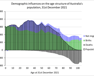
The green bars show the original size of each cohort – the number of babies born in each year over the last 105 years. For example, the green bar plotted at age 10 shows the number of babies born in Australia in 2011.
The blue bars indicate the net overseas migration experienced by each cohort over the entire period from the year in which its members were born up to each age shown. For example, the blue bar shown at age 10 represents the total net migration of the cohort born in 2011 over all years 2011 to 2021.
The dark grey bars represent the total number of deaths experienced by the cohort from birth up to each age shown. Because deaths deplete the population, they are shown as negatives. For most cohorts, the net contribution of overseas migration is positive and so it is mostly shown as a net addition in the top half of the graph.
What do the cohort births, deaths and net migration on the graph reveal? They show, for example, that the bulge in the population age structure from about age 20 to age 40 is not the result of a surge in births 20-40 years ago, but due to net overseas migration gains to the population. Similarly, we can see what is responsible for the small peak in the population around age 50: the surge in births in the early 1970s. The slight discontinuity in the age structure around ages 74 and 75 marks the start of the baby boom just after the end of World War II and a slight increase in cohort net migration. Towards the highest ages, the major factor influencing population size is, not surprisingly, mortality. Overall, the graph indicates what a substantial contribution net overseas migration has made to the size and age structure of Australia’s population.
Of course, the graph above doesn't provide any underlying explanations of fertility, mortality and migration, but it does at least offer a basic explanation of Australia's current population age structure in terms of cohort births, deaths and net migration.
Population numbers at 31st December 2021 and births were obtained from the ABS website. Cohort deaths were obtained from ABS and the Australian Demographic Databank. Cohort net overseas migration was calculated as a residual as should be regarded as approximate due to possible errors in the other demographic components.